
How and where to use color in the home can be a tricky subject. Some people are natural lovers of all things color and are happy to bring it in everywhere that they can in their home. Other people prefer more muted designs and would balk at anything that was too much mustard yellow or sage green. Neutrals have tended to reign supreme, at least when it comes to the larger, more difficult to replace items in the home (think appliances, cabinets, flooring). But sometimes throwing in some color, even in small amounts, can add some unexpected drama and character to a room. When done right, color can set a room apart. Keep reading to get some ideas from a few of our previous projects on how to do color well in your home design.
This bedroom uses a bold, rich hue of purple on the walls to create a striking look. The use of color in this room gives it unique personality and a sense of fun. Combined with the decor, this room is truly one of a kind. Without the bold wall color this room would be just another bedroom with nothing super special or noteworthy (although the bust that hangs over the bed deserves its own accolades). Best of all for those who are more color wary is that paint isn’t too incredibly difficult or expensive to swap out when you’re ready for something different.
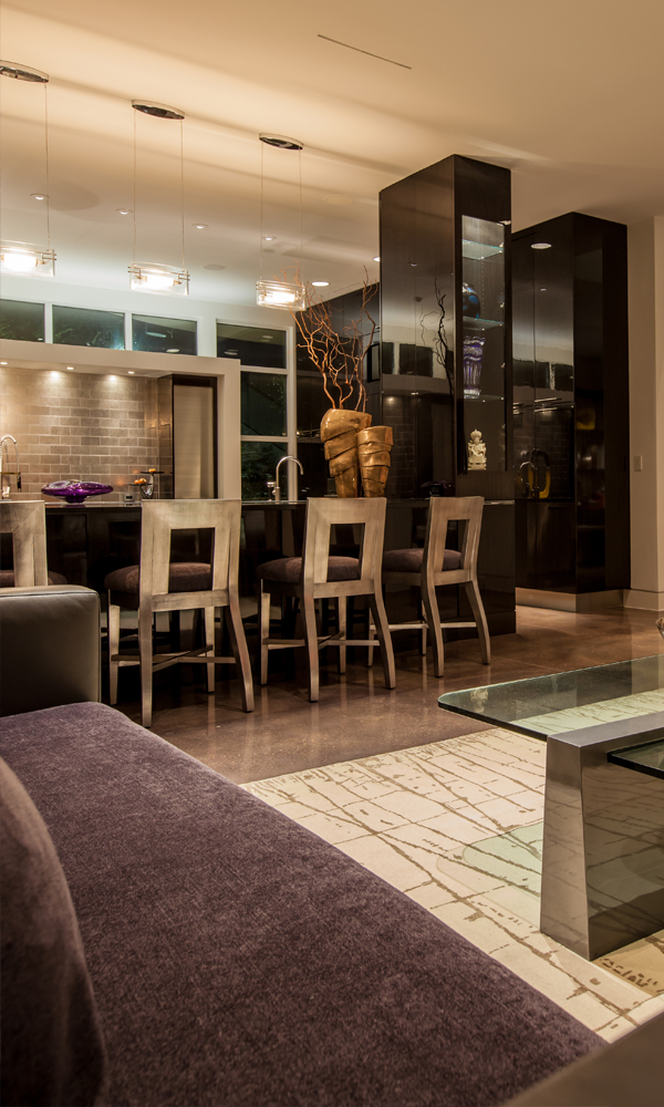
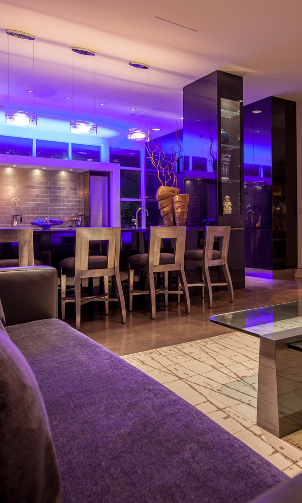
At first glance this modern styled kitchen doesn’t seem to feature any exciting colors and would seem the epitome of how to use neutral colors without it feeling stale and safe. But don’t let that fool you. With just the flick of a light switch this kitchen is transformed! When the purple lights are turned on this kitchen has a completely different look and feel. The shiny finishes throughout the room help to reflect the purple light and spread the color throughout.
This kitchen does not shy away from color. It incorporates various shades of blue throughout in the cabinets, countertops, and backsplash tile. Mixing the blue with white features helps the bolder color choice to not be too overwhelming. But interestingly, blue cabinets are currently newly trending as a hot item in design, so we like to think that these homeowners must’ve had a hint about the future when they designed their remodeled kitchen.
The only truly non neutral colored item in this bathroom is actually just the wallpaper. But its prevalent use throughout the room, the lack of any other non neutral colored items to compete with (save for the bright orange stool), and the shiny bathroom fixtures that reflect the color make this bathroom seem like it is just popping with color. The wallpaper features a more muted tone of green which helps contribute to a relaxing feel for the room, exactly what you would want in a master bathroom retreat.
The neutral brown tones from the wood and brick in this outdoor kitchen border the line of becoming too overwhelming. Luckily the homeowners choose a fun and colorful mosaic tile backsplash to help break things up. Green is the dominant color of the tile but it also features a mix of blue, yellow, tan, and brown tones. Most importantly though, the tile pairs well with the other source of non neutral color in the kitchen, the Big Green Egg.
When it comes to home design, most conventional advice will tell you there are certain items where non neutral colors should not be used. These are typically the big ticket items that will either cost you a lot of money to change out or decrease the resale value of your home because future owners will have to pay to change it. Large appliances are an item that fall into this category. But sometimes the risk is worth it if you find a truly remarkable piece. Take this retro refrigerator in avocado green. It feels right at home in this country rustic styled outdoor kitchen and is a worthy exception to the rule of always getting appliances in neutral colors.
This living room does not shy away from its use of the dark, saturated blue that is seen throughout. From the walls to the furniture to the decor, blue is very prevalent. While some homeowners might mix in non neutral colors in smaller ways, this living room shows that large doses can work as well when you’re willing to truly commit to it. The blue helps contribute to the high end and luxurious feel of the room without being too heavy handed.