As one of the most important and most used rooms in the home, a well-functioning kitchen is essential to a well-functioning home. And while not quite as essential, style and design can also make an immense difference in whether the kitchen is a place that is loved or dreaded. With over twenty years since its last remodel, the kitchen of this Dallas home lacked in both functionality and design. The homeowners partnered with Mark Fletcher of Deleo & Fletcher Designs to design a high-end kitchen that both honored the home’s history and traditional design while also incorporating modern amenities and luxuries. Key Residential was brought onboard to bring the design to life.
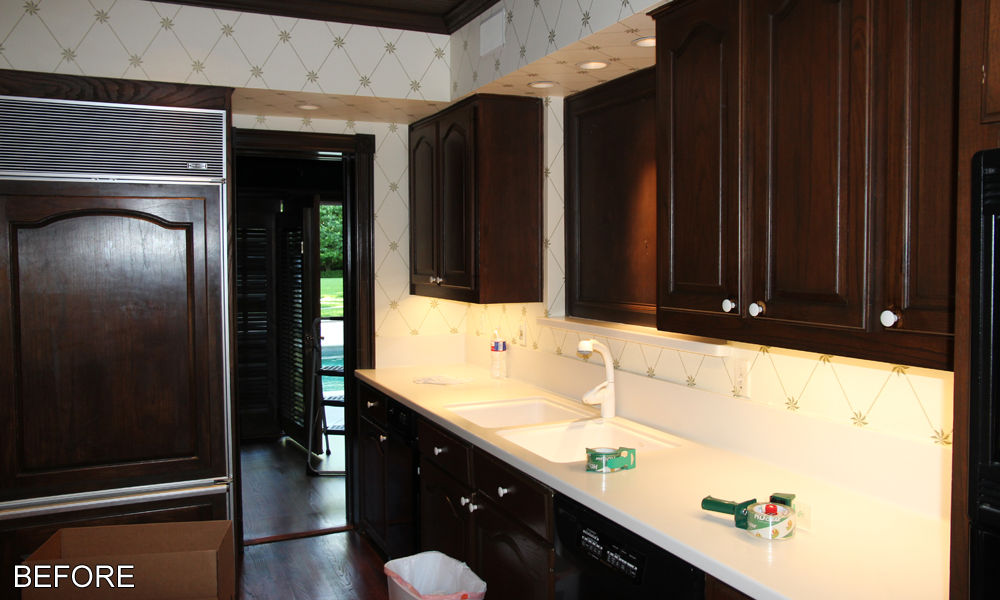
Before the remodel, the kitchen had a very dark and enclosed feel. The dark stained wood of the cabinets, the fir downs, and the narrow door frames only exacerbated the cramped feel. Creating a room that was more open and felt larger was a key goal of the homeowners. Furthermore, they wanted the room better connect with the adjacent living areas. Without many options to truly expand the room, the homeowners made strategic design decisions to maximize the space and give it that larger feel that they desired.
For starters, the homeowners did find a way to claim more actual square footage for the kitchen: by expanding it into adjacent rooms. The small breakfast room off the kitchen was the easiest space to connect. Removing the narrow open-door frame that separated the two areas increased connectivity and made the breakfast room feel like a natural continuation of the kitchen.
A smaller room, the homeowners decided that converting the breakfast room into a morning room would be a better use of the space. Buffet cabinets were added along one wall and frame a wall mounted TV. Two comfortable recliners were added, providing a space where the homeowners can relax in the morning with a cup of coffee while catching up on the news. Completing the renovations in the morning room are new larger windows that allow an influx of natural light into the room, a proven design trick for making a room feel larger.
But now a new location needed to be found for the breakfast room. Luckily there was an easy solution. Adjacent to the kitchen, but again separated by a narrow open-door frame, was a garden room. With ample general living space in the nearby living room, commandeering the garden room for use by the kitchen would not be an issue. Plus, with a growing extended family, a larger breakfast room would provide the homeowners with a more intimate and low-key setting to host family meals together.
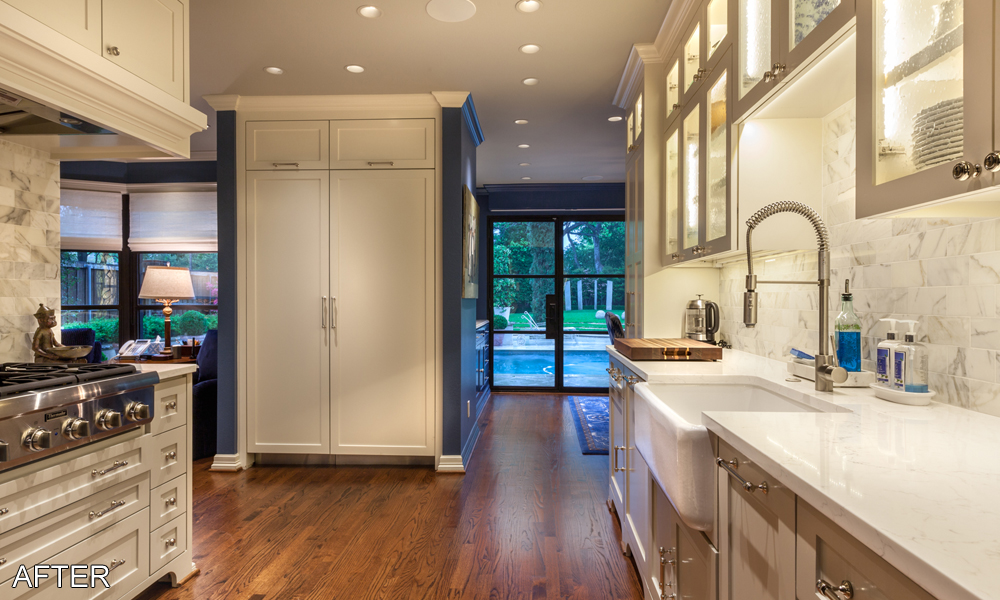
As with the morning room, the door frame that separated the new breakfast room from the kitchen was removed. Matching buffet cabinets, albeit in a different color, were added along a wall of the room. The quartz countertop and backsplash and the leaded glass fronts for the upper row cabinets give them a luxurious appearance. The area is spacious enough to fit a large dining table without feeling cramped and new floor to ceiling steel framed windows provide a beautiful view of the backyard. But if the homeowners need privacy then the Lutron controlled shutters can easily be brought down to obscure the view.
Within the original kitchen space new cabinets that follow a similar footprint as the old cabinets were added and match those added in the morning and breakfast rooms. Removing the imposing fir downs allowed the new cabinets to extend to the ceiling. The white color of the cabinets helps to create a lighter and more open feel in the room. The cabinets feature a recessed panel design with feet to mimic the look of furniture, details that fit well within the traditional design scheme of the house. The upper level cabinets feature glass fronts so that the homeowners can display their more artistic dining pieces. While this cuts down on available storage space in the kitchen it is made up for by the additional cabinets in the morning and breakfast rooms. Ample storage space is one thing the homeowners will hopefully not need to worry about in their remodeled kitchen.
New top of the line appliances were added including a 6 burner gas range top, panel ready refrigerator and freezer, microwave drawer, and trash compactor, to name a few. The light-color of the quartz countertop and quartz tile backsplashes was a strategic choice to help make the room feel open and light. The darker blue color of the walls might create an imposing feel but the use of lighter colors throughout the room and the general lack of open wall space to feature the blue color help mitigate the risk. Under cabinet task lighting s additional lighting to help chase away any lingering feelings of darkness.


