Over the past two months our blog has featured an in depth look at the kitchen and living room portion of the remodel of this historic Dallas home. In our latest blog post it’s time to take a closer look at another major portion of the project: an elevator addition. The homeowners loved their home and wanted to be able to age in place. As such, their home needed to be equipped to handle any changing needs they might have in the future. Because they were already engaged with the large-scale remodel of other areas of the home, they decided that this was the perfect time to tackle the addition of an elevator to help make their future, and current, lives easier.
Adding an elevator onto a home tastefully can be tricky. In most cases, including this project, there is not enough space in the existing home for an elevator so that space has to be added on. But all too often these elevator shaft additions can stick out like a sore thumb. In many cases the elevator shaft addition is just a rectangular tower tacked on to an exterior wall of the house. The homeowners greatly valued the Tudor style and design of their home and did not want to sacrifice those elements for the sake adding an elevator. They wanted the elevator addition to seem like it had always been an intentional part of the home.
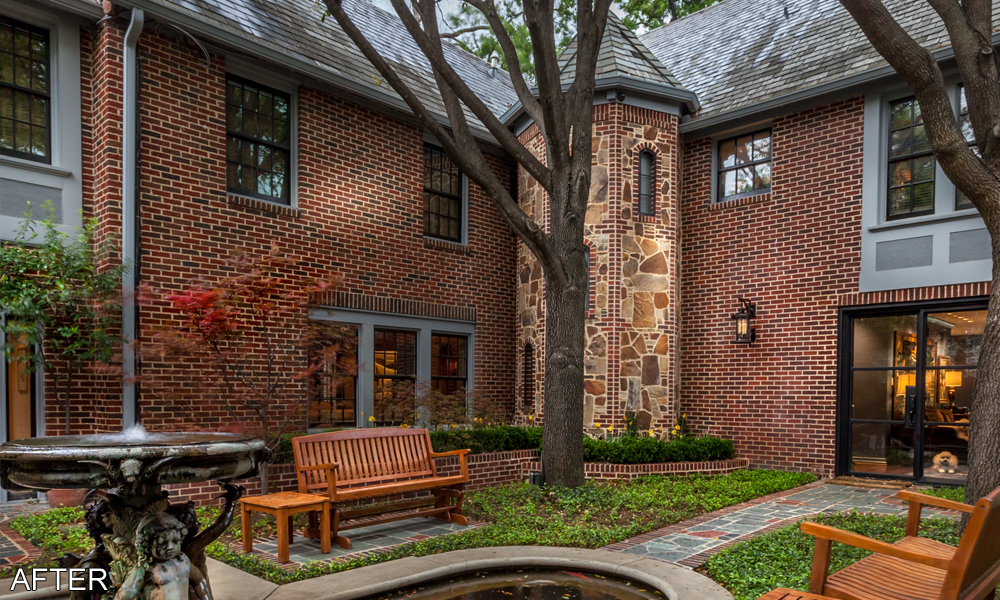
To accommodate the homeowners’ desires, careful thought was put into the design of the elevator shaft. Architecturally, the elevator shaft was designed to mimic the look of a European castle turret. The three niches within the exterior of the shaft resemble windows and their ascending placement around the shaft gives the structure an appearance of housing something like a rounded staircase. But the niches are not actually windows. They were made using a slate background and a steel grid that matches the new windows in the living room and kitchen to closely mimic the look of a window. To further aid in ensuring that the elevator shaft blends in with the design of the home’s existing exterior, the brick and stone masonry material was carefully matched with material originally used on the home when it was first built.
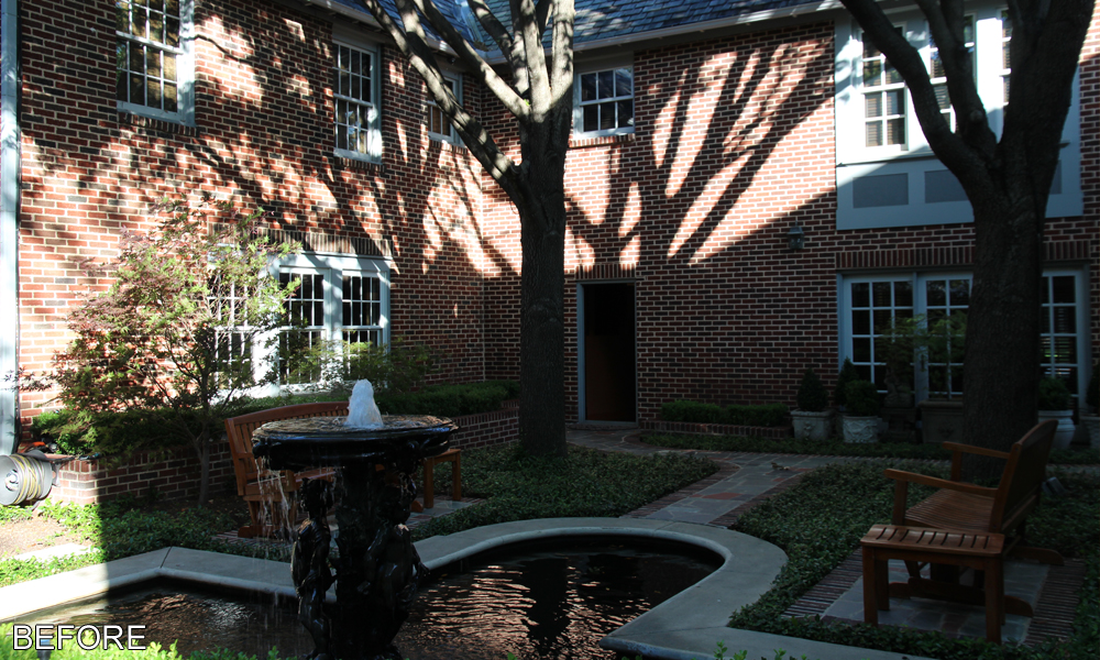
Some of the landscaping in the courtyard had to be reworked to accommodate the new elevator addition. The walking path was rearranged as it used to lead to an exterior entry door where the elevator shaft was added. New built in flower beds were added around the shaft that tie in with the existing flower beds. Again, the brick and stone masonry that was used match original materials used to construct the house to create a seamless transition between the old and new parts. If someone were to walk through the courtyard they would never know that the tower-esque structure had not been built along with the original house.
The interior of the elevator is paneled with dark stained wood that matches wood wall paneling on the second-floor landing. The brass finishing of the elevator mechanics gives it a classy and high end finish. On the first floor the elevator entrance can be found on the far side of the remodeled bar. Its close proximity to the kitchen and living room allows for added convenience of use in the large house. On the second floor the elevator opens to a hallway that leads to the master suite. Placing the elevator in this location allows for the best possible access to the areas of the house most used by the homeowners.


