A high-rise condo unit remodel comes with its own unique challenges and opportunities. Fully remodeling this ninth-floor unit in Dallas was no exception to that rule. But one thing is for sure, despite the unique setting the results are still spectacular. Originally a three bedroom-two bathroom set up, the unit had a very outdated look that had not been updated in a long time, if ever. The space felt cramped, especially in the small enclosed kitchen, and used design elements that hadn’t been popular for at least a few decades. When the homeowner purchased the unit it was clear that some changes needed to be made to modernize and make better use of the available space. Keep reading to find out more about the stunning results of this latest Key Residential remodel.
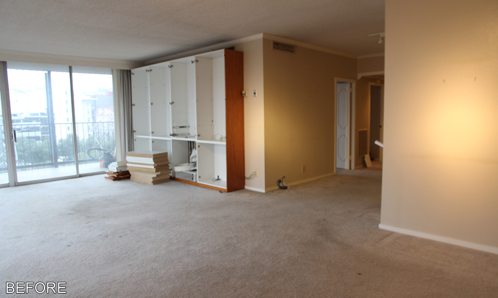
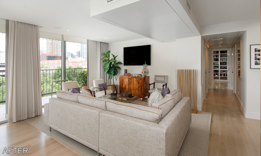
The first step of this remodel was to rework the existing footprint so that it would better suit the homeowner’s needs. As the sole resident of the condo, the homeowner did not need all three bedrooms, so converting one of them was an easy place to start. The interior walls surrounding the third bedroom were removed so that it could become incorporated into the general living area. The former bedroom area was converted into an informal den area.
Next to the new den is the formal living room area. With the addition of the den, the original living room area could now be used as a formal living area. Both the den and the living room get to take advantage of the stunning view out of the floor to ceiling windows. Also connected to the den and living room areas is the new dining room area (more on the decision to move that space in a moment). A small bar area was created out of an old closet in the dining area and includes custom designed cabinets with a marble countertop, an undercounter beverage fridge, and a mirror backsplash with floating glass shelves.
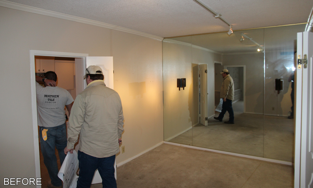
Another key area where space needed to be added was in the kitchen. The small, enclosed kitchen was vastly outdated and confined. Luckily the original dining area that was adjacent to the kitchen provided the perfect solution. The wall that separated the kitchen from the dining area was removed so that the kitchen space could be expanded. Doing this not only provided the kitchen with more space and a sense of openness, but it also helped to create a quasi-open floor plan feel with the adjacent den, relocated dining, and living rooms.
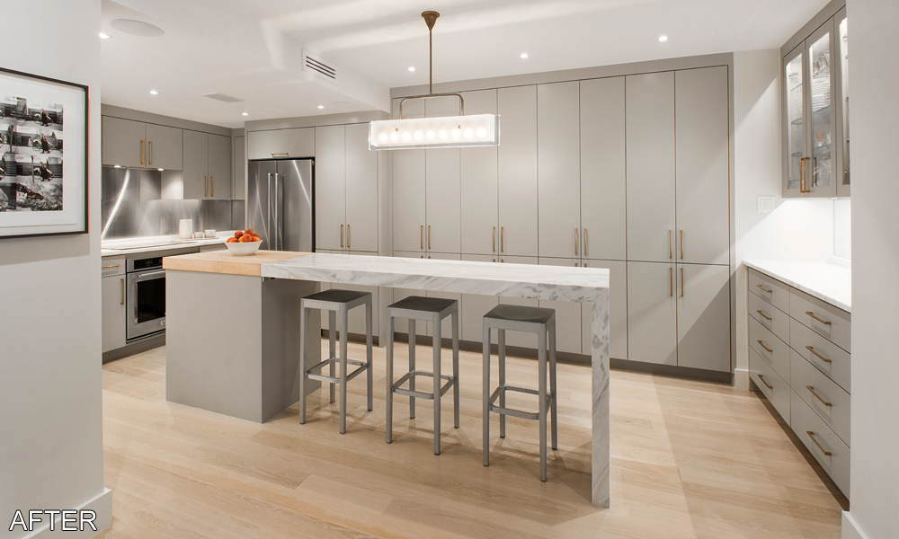
The new kitchen features custom designed gray painted cabinets with solid panel fronts, marble countertops, and brass finished hardware. The use of the brass finished hardware is uncommon in a world still dominated by the more popular polished nickel, but it helps give the kitchen a unique and distinct look. Along the sink wall open upper shelves were installed to provide additional storage space but not over clutter the kitchen with more enclosed cabinets. The cabinets were designed around a necessary structural column for the building that could not be removed. New KitchenAid appliances with a stainless-steel finish include the refrigerator, oven, dishwasher, and induction cooktop. The large undermount apron sink also has a stainless-steel finish that matches with the appliances.
The remodeled kitchen easily solves the enclosed and claustrophobic issue that existed previously. The additional space in the kitchen allowed enough room for a narrow, but long, island to be added that spans the width of the room. The island features a few extra drawers for storage as well as space for bar seating. The lack of cabinets below most of the island allows the bar seats to be safely stored out of the way when not in use. As with the perimeter cabinets, the island also features a marble countertop. The foot for the far end of the island uses the same marble countertop material and connects to the island with an infinity edge to give it one continuous look. The island also features a small section of custom butcher block countertop above the drawer storage section of the island.
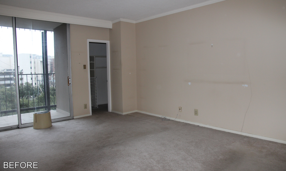
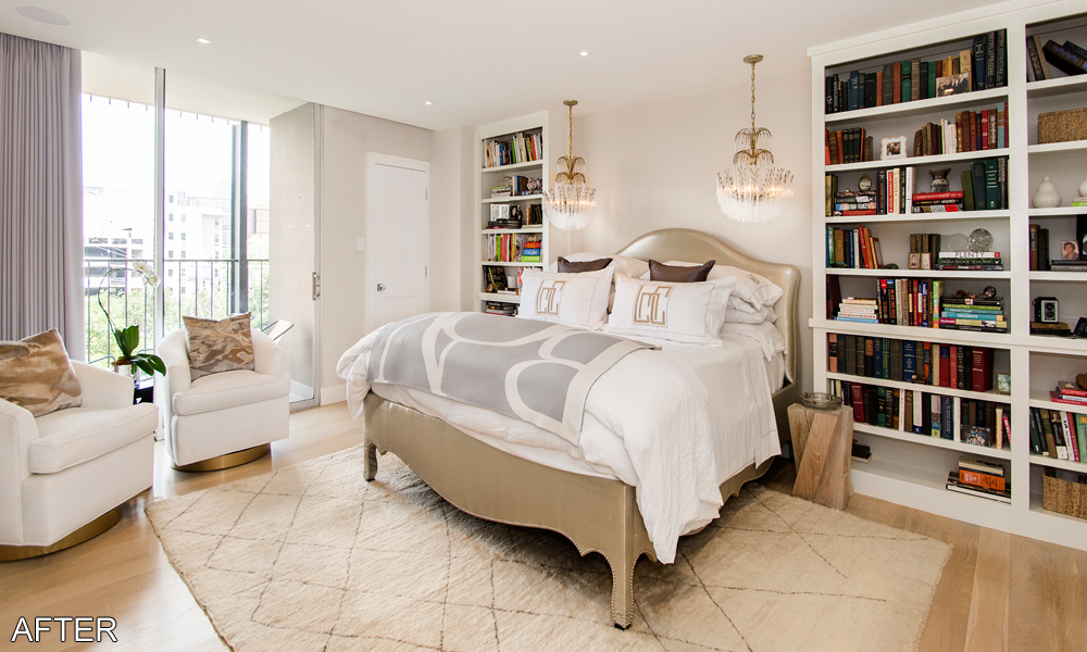
The master and guest bedrooms required minimal updates, but the small changes that were made still provided a remarkable difference in the spaces. Both rooms received new custom designed built in bookcases and new curtains. A fresh coat of paint and new trim did wonders in helping with their transformation. In the master bedroom dual chandeliers were hung over the head of the bed and lighting controls were built into the side of the one of the bookcases so that they could be used without leaving the bed.
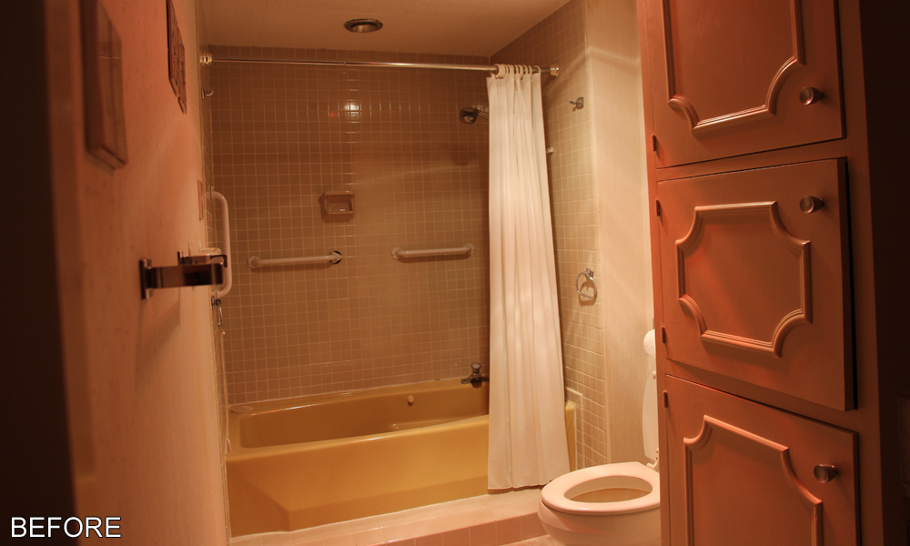
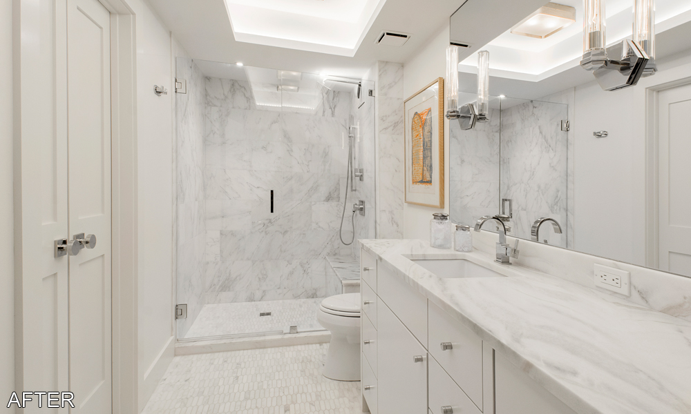
The two bathrooms were another area that saw quite a few updates. In fact, both were gutted and completely rebuilt with all new plumbing fixtures and cabinets. Within the master bathroom a few structural changes were made to make better use of the space. Originally the master bathroom was entered via a small hallway from the master bedroom. This hallway was removed and incorporated into the master closet and the master bathroom is now accessed directly from the master bedroom.
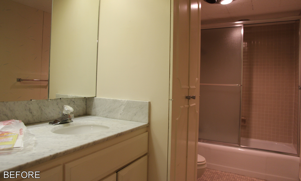
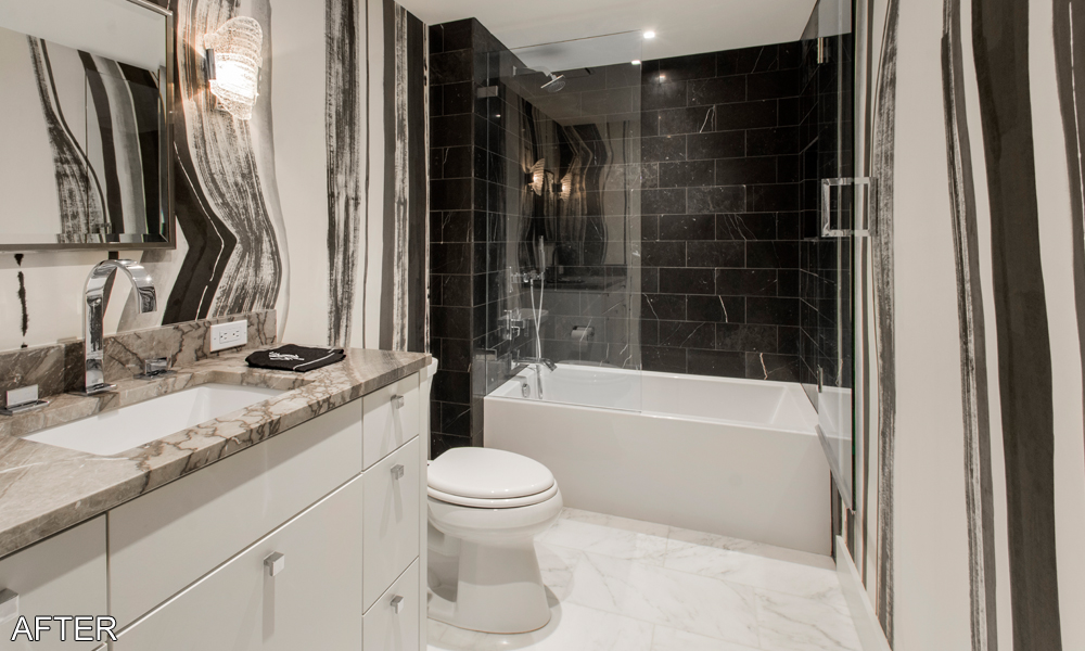
Both bathrooms received new custom designed vanity cabinets with marble countertops. The old floor to ceiling cabinets that were in both bathrooms were not replaced to promote a more open feel. In the master bathroom the old tub/shower combo was replaced with a large walk in shower. A light colored, marble designed tile that matches well with the vanity countertop was used throughout the master on the floors and shower walls. The shower includes a built-in bench and soap niche and a glass surround. In the guest bath the tub/shower combo design was kept, but the old tub was replaced with a larger contemporary styled tub and a glass surround was added to keep with creating a more open feel to the room. The dark tile surround in the tub/shower combo matches well with the hand painted black and white wallpaper used in the room.

